Developing for the Mobile Web, 27 Oct, 2010, Bristol, UK
DevCSI and the Institute for Learning and Research Technology (ILRT) brought together developers, project managers and others with an interest in the mobile web to share experiences at a one day workshop at the University of Bristol. The day saw demonstrations from the developers of MyMobileBristol and Mobile Oxford, discussion of W3C best practice recommendations, presentations about HTML5 and CSS, lightening talks and debate about mobile web verses native app development.
In this report, we will summarise the key points raised and link to further resources so you can watch recordings of the presentations in full and find out more about the various showcased projects.
Mobile Web Best Practices: Lessons Learned Since 2008
Philip Archer – W3C
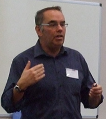 Philip Archer opened the workshop with an overview of W3C’s best practice recommendations for developing for mobile web, which were published in 2006 before the iPhone had come onto the scene and changed the way we view the world of mobile.
To give us some context, Archer reported that 40% of web traffic to mobile goes to Apple devices (only 15% of handsets), despite Nokia still having the main market share of handsets. This produces the belief that the mobile web is really just the iPhone, which is not true. He warned against developing exclusively for smart phones, thus excluding 75% of your potential audience.
Archer took us through the basic assumptions behind the recommendations and some of the design principles involved, which are designed to address the diversity of devices and the practical restrictions of mobile devices, including limited processing and battery power.
Whilst there are things that are out of date – Archer cited access keys and CSS media type as examples – he stressed that 58 out of the 60 best practice recommendations are still valid. However, he said it is quite common that people assume everyone has an iPhone and builds for that, not for a variety of mobile devices, which can present problems.
His key point was the fundamental assumption that there will only be one web, which underpins the recommendations. If a user has to make a choice between two different versions of a website, you are effectively splitting the web in two, which is bad practice given that the architecture of the web survives on links.
Archer concluded by telling us that W3C has now developed 32 new recommendations for best practice when developing mobile web applications and there will be a new online course based on these in available 2011.
Maps and Apps with HTML5
Ben Butchart – EDINA
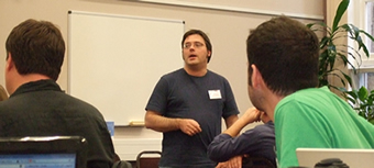 Rather than leaping into building an iPhone app, Ben Butchart’s team asked JISC for funding to look at the alternatives and see what is really the best option for delivering mobile services – particularly focussing on interaction with map data. He noted that this is a very exciting time to be involved in web applications, as browsers are not competing on design features but they are competing on performance.
In his presentation, Butchart outlined the context for this work, his team’s technical requirements and discussed the various technologies that they examined, which included geolocation API, HTML5 canvas, HTML local storage, HTML5 cache, CSS and Flash.
Butchart described OpenLayers, which is “a pure JavaScript library for displaying map data in most modern web browsers, with no server-side dependencies”[1] and analysed how this and the alternative TouchMapLite compare in terms of their requirement to make use of touch screens. He directed us to his team blog at http://mobilegeo.wordpress.com for more information and exploration of these tools.
He went on to describe their work with HTML5 Canvas, which presented a real opportunity to extract information from a map image at the pixel level. This could help reduce the number of ledger symbols displayed to those necessary for interpreting a selected area of a map, making it really useful for a mobile device with limited screen real estate. He also emphasised the importance of using mobile applications offline and discussed their examination of local storage using HTML5 local storage and HTML5 cache.
Finally, Butchart also drew our attention to new work in the augmented reality arena, including the challenges face by an anatomy application designed to show the inside of buildings. He emphasised that there is too much innovation going on in this arena at the moment so it is too early to pinpoint points of interest to start building the standards, but exciting work is going on.
Native Applications vs Mobile Web
Anthony Doherty – Liverpool John Moores University
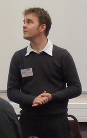 Anthony Doherty’s presentation focused his department’s experiences when tackling two of the core issues faced by developers in institutions: choosing between a native application and the mobile web, and dealing with outsourced development.
LJMU developed an interest in nurturing a mobile environment and looked for an external supplier to develop a native solution in late 2009. The web team felt their role in this project was to emphasise the difference between the native app and the native web, and to continue to work towards their main website being accessible for mobile.
The native application, which delivers student news, campus maps and location based services, was launched by the external supplier in September. They have received positive user feedback so far with 2056 downloads. However, there have been a number of back end problems which need to be resolved, including full systems integration, high content management overheads, identifying user accounts and therefore providing appropriate alerts. Doherty also discussed several front end issues, including limited benefits from the supplier’s “Friend Finder” feature and the number of key devices not supported – specifically Blackberry, Windows Mobile and Android.
Whilst the native application has its uses, Doherty’s team hopes to create a true mobile website that better integrates with the university’s internal systems. He acknowledged that users might not want every bit of information on the main site, but the core functionality of the website does need to be available to mobile devices. He concluded by identifying the next challenge ahead: dealing with web content authors and guiding not just how they write for the web but also how they write for the for the web in different forms.
MyMobile Bristol
Mike Jones – Web Futures, ILRT, University of Bristol
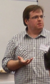 Mike Jones introduced the MyMobileBristol project, which is a one year JISC-funded project involving collaboration between people within the university and Bristol City Council. The project has a number of deliverables, including providing collaborative platforms, workshops, and integrating time/location sensitive information in Bristol.
Jones noted that they were initially specifically targeting iPhone and Android users, but are planning to address certain issues so that it works on a wider variety of devices. He explained that the aim of the project is to produce a tool to help answer some of the practical questions asked by the students in Bristol, such as when a computer is available and when the next bus will arrive at campus. He took us briefly through the architecture of the site and its development history before giving us a quick demonstration of the site.
Of particular interest to many in the audience was the approach to providing real time bus information, which is one of the most popular features of the site. They get the location of bus stops via the NAPTAN database, then scrape real time information from the council’s website. They are working with the council to get this data in a better, more stable format and the council is very keen to expose this data for commercial applications, so are viewing MyMobileBristol as a test client. Project Manager, Nikki Rogers, also explained that part of their funding comes from JISC’s Greening ICT budget, so they are hoping to carry out some studies using MyMobileBristol to demonstrate whether providing real time public transport information in this way will influence people’s travel decisions when attending events at the University of Bristol.
Mobile Oxford
Tim Fernando – University of Oxford
 Fernando provided an overview of the Mobile Oxford project, which is now available as the open source Molly Project.
The Mobile Oxford site receives 2,500 unique users per week, with an average of 5 page views per visit, making it a popular solution to a range of location-based information requirements.
Fernando explained how they have responded to the diversity of devices used to access the site by detecting the browser and classifying it as a desktop, smart phone or “dumb” feature phone. A feature phone will give you a practical, list-based view of the site with virtually no images, whilst a smart phone or a desktop will give a more graphical interface.
He went on to discuss the range of data sources and features of the site, including “Places” which uses a local store of places in their OxPoints database and Open Street Maps. There is also a library search which combines the Z39.50 library protocol with Open Street Map data to pinpoint the location of a specific book, and a “Weblearn” section, allowing lecturers to take a poll of their audience by using a QR code in their slides.
Fernando emphasised the need to constantly gather feedback, demonstrating that every page has a provide feedback button and feature suggestions which can be voted up or down. This feedback has helped to identify unforeseen uses for the site and prioritise new features. They aim to provide XML, JSON and YAML feeds to encourage students to write their own applications.
Fernando concluded by observing that the mobile space is developing so quickly that whatever is being developed today will not be around in 2 years, so having the data in useable forms is more important rather than developing the interface.
Lightening Talks
The workshop heard a series of short lightening talks from participants, including:
Mobile Web At Loughborough by Martin Hamilton from the University of Loughborough
Mobile Apps In The Cloud by Ed Crewe from the University of Bristol
The Mobile Accessibility Stack by Steve Lee from OSS Watch / fullmeasure.co.uk
One Geodatabase To Rule Them All by Rich Osborne from the University of Exeter
Best Practices for Writing CSS
John Gallant – positioniseverything.net
Gallant delivered his presentation remotely via Skype from his office in Phoenix, Arizona. In it he discussed a wide range of tips for writing effective CSS, with particular emphasis on coding as part of a team and techniques to help reduce the bandwidth requirements of a site – a high priority when designing a mobile site.
In particular, Gallant advised avoiding fixed body backgrounds, which may look great on a desktop but will make a mobile viewer struggle, and promoted the word-wrap property, which breaks off text stings so they do not flow out of their containers and therefore display more effectively on a small screen. He also recommended avoiding redundant declarations, minimising the number of stylesheets, and using border-radius to create curved corners and drop shadows. The latter technique now works with most browsers and Gallant feels this will be especially useful for mobiles sites as it significantly reduces the load time.
Gallant left plenty of time for questions and debate, which provided an opportunity for the group to discuss issues such as creating overriding stylesheets for handheld devices, testing and dealing with I.E 6.
Conclusions
Participants reflected on a variety of issues as a result of this event including whether there is any reason to go native rather than web-based as hardware APIs become available, whether it is easier to write a native application that works offline and is faster rather than a web application which is much slower to develop, and the types experience that users expect.
Many delegates were challenged by Philip Archer’s advice about the one web and inspired by the solutions and experiences shared by those working on mobile projects.
Audience Responses
We interviewed a mixture of delegates, speakers and organisers to get their reactions to the day and hear how the issues discussed related to their work. Select a link to hear these different perspectives:
Nikki Rogers, Project Manager, MyMobileBristol, University of Bristol
Georgina Parsons, Systems Librarian, Brunel University
Gicela Morales and Katja Durrani, Freelance developers
Tim Fernando, Project Manager, Mobile Oxford, Oxford University
Mike Jones, MyMobile Bristol, ILRT, University of Bristol
Jamie Aylward, Web Developer, University of Exeter
Dick Davies, Senior Web Engineer, Cardiff University




Recent Comments